Seeing Science

Growing up, Elizabeth Lovero considered herself the art kid in a STEM family. In high school she became interested in visual art, and on family vacations she would convince her family to visit local art museums.
Today, she combines science with art as a data visualization engineer at the Flatiron Institute’s Scientific Computing Core (SCC). At the SCC, Lovero comes up with new ways to help scientists visualize their work and share their datasets with others, both within the scientific community and beyond it.
Before joining the Flatiron Institute, Lovero held a diverse set of positions, including being a software engineer and a contemporary art curator. She earned her master’s degree in information science from the University of Texas and has completed graduate coursework in art history at the City University of New York.
Lovero recently spoke to the Simons Foundation about her work and the role art can play in science. The conversation has been edited for clarity.
What work do you do with the Scientific Computing Core?
Typically, someone at the Flatiron Institute has produced an interesting software suite or tool or new dataset that they want to share with the other scientists or the broader public. I work closely with the scientists to create and iterate the tools that help them to share their work. This cross-disciplinary partnership fits in well with the larger picture of collaboration in the scientific community, which is so significant in this era of science, and is obviously a major part of what we do at Flatiron.
A big project our team has been working on is a tool called the Flatiron Institute Data Exploration and Comparison Hub, or FlatHUB. FlatHUB is a platform that allows astrophysicists to share catalog data from simulations or observations about the universe to, hopefully, connect new frontiers of space. My role has been developing an interface that allows anyone to compare astrophysical properties in these datasets, to look for correlations. There are already more than 10 astronomical catalogs that can be compared.
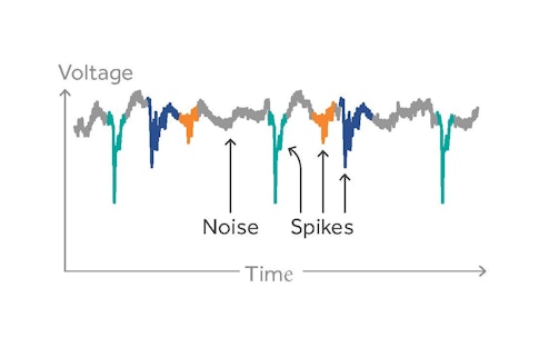
Before that, I worked on a project called SpikeForest, which focuses on electrophysiology data. When neuroscientists track activity in the brain, they make recordings of neurons’ electrical activity. However, this method picks up all kinds of signals, not just the neurons scientists they want to study. To sort out signals of individual neurons from the noisy data, they generally use a sorting algorithm, but there are many such algorithms, and no consensus on what works best. Each dataset is unique, and some algorithms simply work better in certain cases. What SpikeForest does is to help automate the decision on which algorithm to use by analyzing a scientist’s dataset and matching it with the best sorting algorithm for that particular dataset.
Another project I’ve worked on is related to system tools and time allocation. Some types of computer simulations can take days or weeks, and since we have limited computer resources, not all scientists can run their simulations at the same time. To streamline scientists’ work, I’m setting up systems that can help scientists plan the best time for them to run their simulations. Eventually I hope to have an interface where scientists can look at the current status of our computing resources and plan their work more effectively.
How is data visualization essential to science?
Data visualization has a huge role to play in helping make new discoveries and communicating those findings, both to the scientific community and to the public. Speaking of the latter, the charts and infographics we see in magazines are normally what comes to mind when people think of data visualization. However, there’s also this component that’s used by scientists to make new discoveries. That’s mostly where my work lies.
I personally believe that, first and foremost, we are visual creatures. Visual perception is hardwired into us. This is why art and imagery are so powerful to the human eye. Sight is the primary way in which we gather information, so visualizing data allows us to bring that strength to scientific analysis. Scientists can compare things quickly, and make inferences intuitively that might otherwise be overlooked or impossible to spot.
On the communications side, I think the pandemic has created this environment where people are more interested in looking at scientific data and trying to make sense of it in their own lives. Some people are interested in looking at local COVID data to make their own decision on a question like whether to eat indoors at a restaurant. Others have been introduced to this world of scientific data and visualization through the pandemic, and are interested in learning about other things beyond COVID. In both cases, many people are trying to understand concepts like probabilities and percentages that they’re maybe not familiar with. That’s where data visualization can make things easier to comprehend, and play an important role in helping the public understand science.
What excites you about the future of data visualization?
Data visualization, in one way or another, has been around a really long time. Even before computers, there are famous examples of its usage, like W.E.B Du Bois’ innovative hand-drawn images and charts that showed institutional racism in America in the late 1800s. Du Bois’ advances in data visualization still resonate today as we continue to work on new methods to understand science.
Today, many disciplines — particularly in science — deal with data coming in every second. Being able to build tools and libraries that can handle this immense ongoing stream of data will be necessary. Creating highly adaptable, publicly sharable, fast interfaces for data visualization are a big trend right now that I think will continue to be important, especially as scientists gather more of these datasets.
I also think we’re really called right now to find new ways to accurately represent big data and combat biases. I think this will require new tools and approaches, both from the mathematical side and from the visual side.
This Q&A is part of Flatiron Scientist Spotlight, a series in which the institute’s early-career researchers share their latest work and contributions to their respective fields.