A New Look for the Simons Foundation Website
During the late afternoon of August 24, 2017, the foundation’s web staff gathered around desktop monitors in the corner of the office. After more than a year’s work, the new site was about to go live. Okay, we weren’t mission control awaiting the re-entry of Apollo 13. But the tension was there, and the joy was real when a screen refreshed and the new simonsfoundation.org loaded.
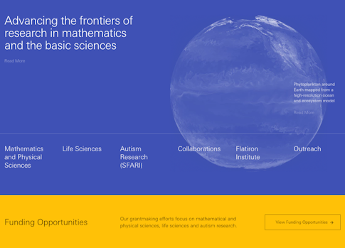
The most obvious change to the site, of course, is the visual experience. Drawing from Bauhaus design principles, the site has an airy, open feel so that pages are both visually appealing and more easily scanned. Mobile users in particular will appreciate these attributes.
Our efforts, however, went beyond esthetics. After studying our website analytics data, we realized we needed a site that helped visitors better understand what the Simons Foundation is and what it does.
To that end, the homepage starts by laying out the six major divisions of the foundation and presenting clear navigation to funding opportunities. Below those elements are foundation announcements and news, including a new section called “What We’re Reading,” which collects stories from around the web related to the foundation’s research and mission, as well as articles from our digital magazines Quanta and Spectrum. A calendar of upcoming public lectures now appears on the homepage too.
Remaking the site also gave us a chance to reimagine the presentations of whole programs. The Life Sciences division now highlights its three research areas and the awards that support that research. All our varied divisions, from the Flatiron Institute to Outreach to SFARI.org — which got an entirely new content-management system as well — have designs that reflect their distinct missions but retain the site’s overall look.
Redesigning two websites and customizing several divisions within to meet distinct needs is a major undertaking. Area 17, a digital design and engineering firm, crafted the website’s look and function. Foundation staff spent many extra hours over the past year providing feedback, testing features, reporting and repairing bugs and building pages. They are: Jessica Bee, Rory Bernstein, Aaron Biscombe, Jacob Cappell, Michael Kranz, Malcolm Mallardi, Jesse Sherwood, Thomas Sumner, Emily Tan, Ursula Wing and Ashley Yeager. My thanks to you all.
Evolution is an ongoing process, and we want the site to evolve to meet the foundation’s needs as it grows. So we will continue to make refinements, both visual and functional, and test and refine again. Let us know what you think: [email protected]
Philip Yam
Editor-in-Chief
simonsfoundation.org


